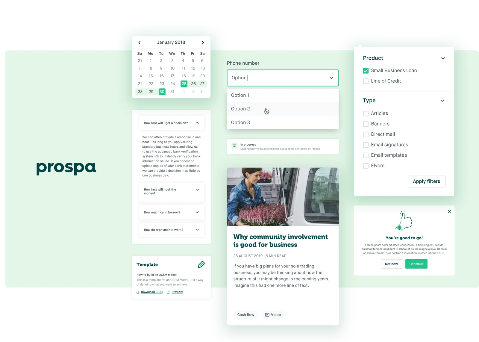
Overview
Prospa is Australia’s leading lender to small business. I was brought into the design team to help build out a unified design system, resulting in design consistency across teams and increased efficiency for both designers and engineers.
Discovery and process
Prospa already had existing branding, which we wanted to keep. The goal of the design system was to unify and create consistency across design and development, not to redesign every component for the sake of it.
Interviewing the people who would use it
As with all product design projects, I began with qualitative interviews with key users of the current design system, which was a simple Sketch file with a few “components” on a sticker sheet. I spoke to designers and engineers about how they used it, the pain points they had, and what we could improve.
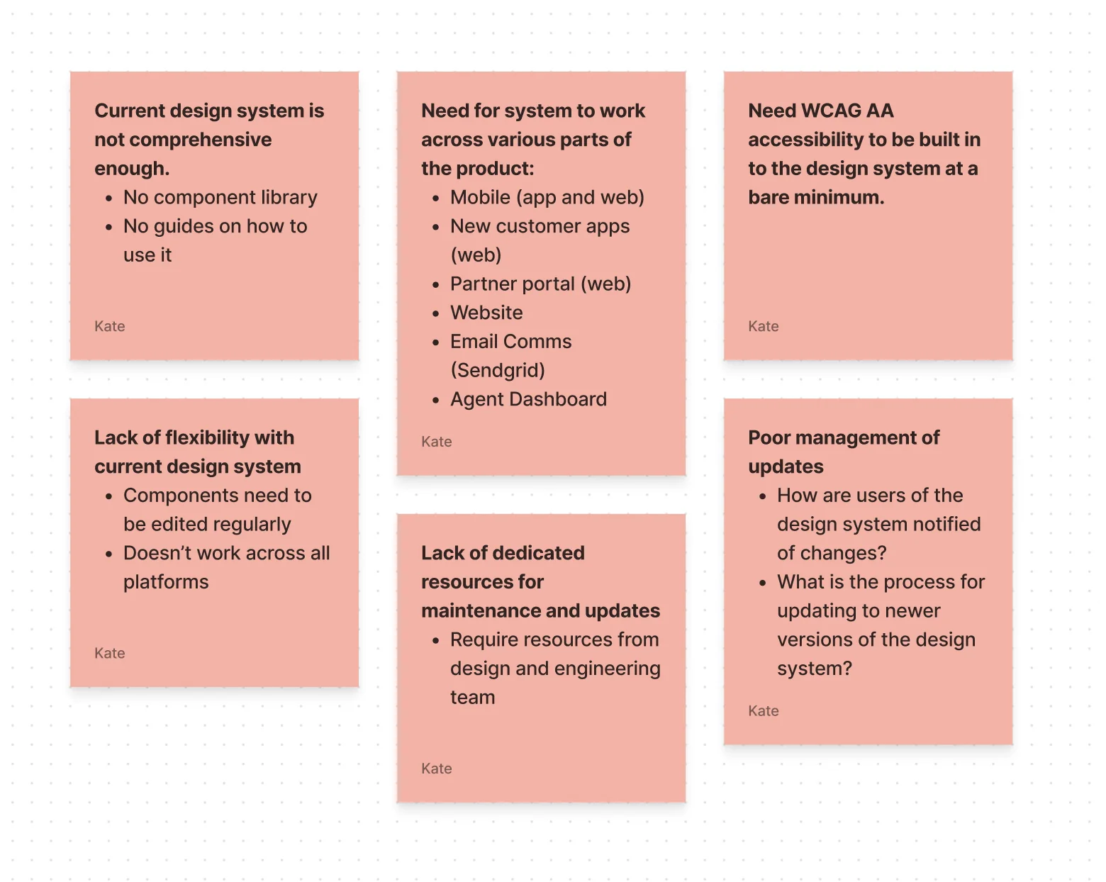
These are some of the pain points we gathered in workshops with design and engineering, which set the direction for the work.
Starting small
After the discovery workshops, I mapped out what our minimum viable product could look like. This meant looking at the key components designers used consistently across platforms, and mapping them into a WCAG AA friendly Figma component library.
Challenges along the way included resourcing (the design system was a side project while I worked in another pod, with no dedicated engineering resource) and managing the move from Sketch to Figma at the same time. I met with engineering team leads to have resources allocated, ran regular design meetups with how-to sessions on Figma, and wrote guides for engineers on Confluence.
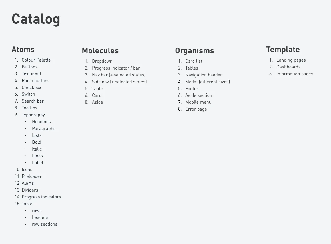
I organised the components and tokens into the common Atoms, Molecules, Organisms and Templates taxonomy.
The system
Once I had gathered all the atoms, molecules and organisms we wanted, I went through any inconsistencies or issues with the design team and we agreed how to fix them.
Next came the Figma library itself, making sure every component was easy for the team to use (for example, they shouldn’t have to detach a component just to resize it or edit text).
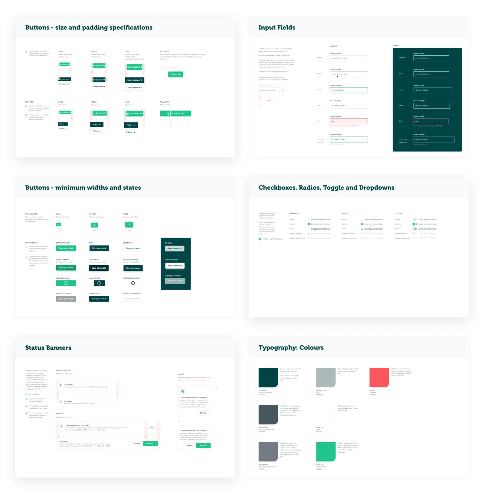
Then the most important part: the guides. They explain how and where each component should be used, and what not to do, for designers and developers alike. Here are a handful of them.
From design to code
A key part of the design system’s success was that it needed to be as useful for engineering as it was for design. I teamed up with the front-end engineering team to workshop how we would build the components we needed across every platform.
We needed components for iOS, Android and web, which meant working with several engineers on platform-specific builds. We had weekly catch-ups to track progress and any changes needed.
Today
The design system I started is used by every designer in Prospa’s design team. We use Figma’s enterprise features to see which components designers often edit, a sign a component might need another look.
The product design team meets fortnightly to discuss design ops, including new features and any issues with the system.
Onwards
The next step is for the design system to evolve as the company goes through a rebrand. Because the system is built on design tokens and shared assets, the team can update multiple products for the rebrand by changing them in one place.