Overview
Hone is an agTech startup that developed the Hone Lab Red, a handheld spectrometer that lets grain growers, agronomists and grain bulk handlers test, analyse and predict the chemical properties of crop samples on the go.
Users scan a grain sample with the device and read the result in the Hone Lab mobile app, which shows moisture, protein and oil content. This helps growers understand the quality of their crop, an important input for farm management, harvest and selling decisions. The device can also measure carbon levels in soil, for carbon sequestration.
As contract Lead Experience Designer, I was responsible for the entire end-to-end customer experience. At a startup that meant wearing many hats, including research, project management and product design.
The challenge
How might we improve the Hone Lab Red to increase sales in FY22/23?
The Hone Lab Red grew out of a PhD project between Hone’s three co-founders, who couldn’t find a portable, affordable way to test grain. The incumbent solution is a large, much more expensive machine usually found at grain silos, so growers had to drive into the nearest town or silo to check the quality of a sample.
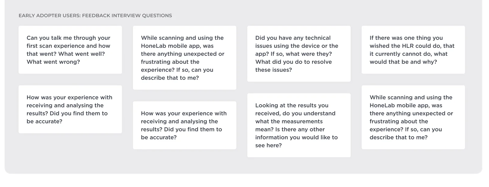
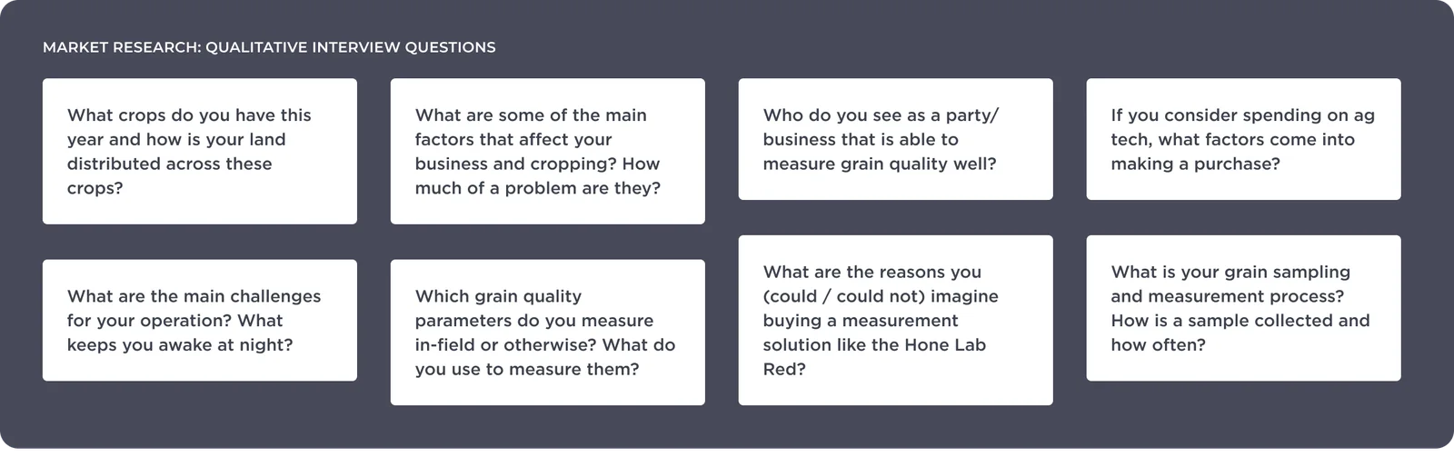
The device had been pre-sold to 10 buyers through a key investor, but little feedback had been gathered. To grow sales, we needed to understand our customers: their personas, use cases, behaviours and pain points. We ran two sets of qualitative interviews:
- User feedback from pre-sale customers
- Exploratory interviews with our target market
The feedback interviews surfaced key areas to address. Most were expected user experience basics that hadn’t made the initial scope because of limited resources.
Understanding the customer
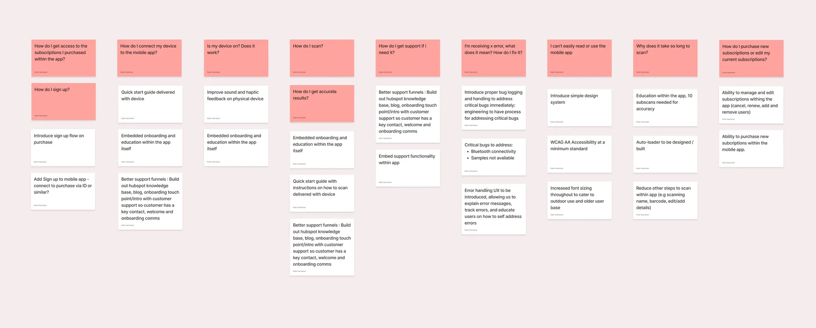
From the interviews, clear themes emerged, which we grouped into common questions and issues. Our customers were mostly grain growers, predominantly male, aged 30 to 60 and not especially tech savvy. They were short on time, often had patchy internet, and usually used iPhones that were 2 to 5 years old. That gave us five areas to improve:
- Onboarding and education. Most customers had never used a spectrometer. They live remotely, so guidance had to be built into the app and the onboarding communications.
- Self-service sign up. Customers had to book a call with the commercial team to get set up, so anyone who bought on a weekend couldn’t use their subscription until Monday. This needed to be automatic.
- Time to result. NMI certification requires at least 10 scans for accuracy, so we had to remove friction everywhere else in the flow.
- Accessibility. The app needed to meet WCAG AA at a minimum. Many customers have some colour blindness, and the app is used outdoors, so it had to be easy to read at a glance. A basic design system would also fix the many inconsistent buttons, fonts and menus.
- Easy to find support. Help should be easy to reach in the app, and the guides in the box should match it.
A faster scanning experience
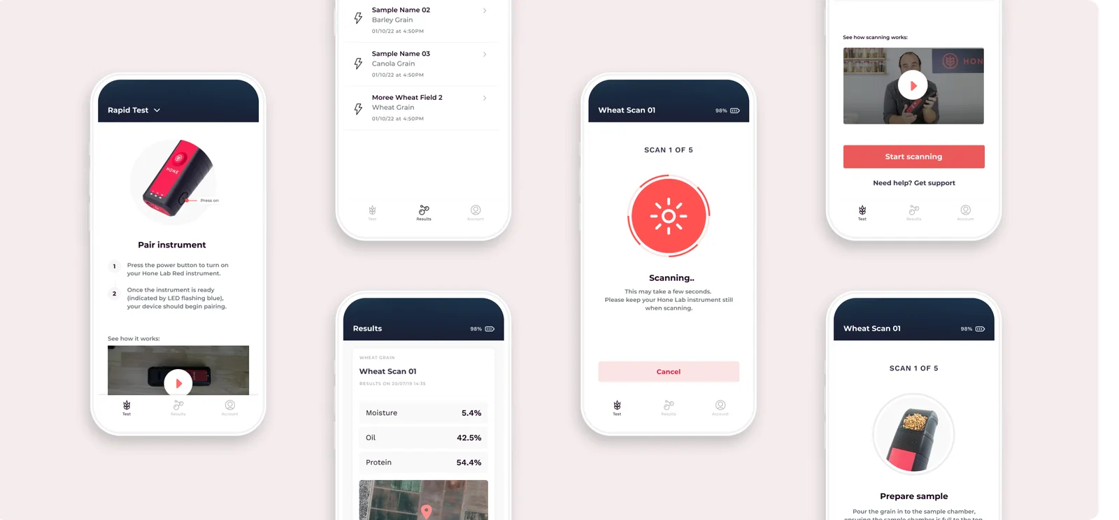
Customers told us they were time poor and didn’t want to learn complicated technology out in the field. The existing scanning flow forced them through steps that weren’t needed to get a result, like naming the sample and tagging a location. We generated these automatically, with the option to edit them.
We added education too: an instructional video on how to scan, plus imagery and copy explaining scanning best practice, so users avoided errors and got accurate results. We also aligned the quick start guide that ships with the device to the instructions in the app.
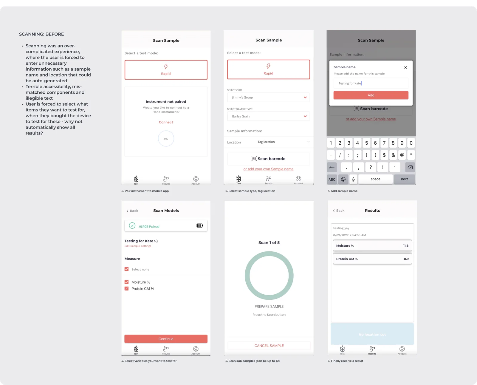
The prototype below walks through some of the changes. Some screens move on automatically, reflecting the device sending feedback to the app.
▶ Open the prototype in FigmaSign up
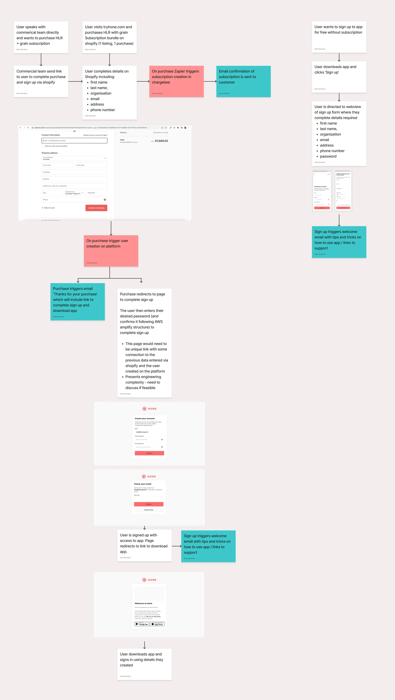
Adding sign up wasn’t as simple as a form with single sign-on. Customers effectively signed up by buying a subscription through Shopify, so we needed to finish their registration on purchase without asking for details they’d already entered.
I worked with engineering on flow diagrams covering everything from buying a device and subscription to creating a password and getting into the app. We then started building the UI shown in the diagram.
Error handling
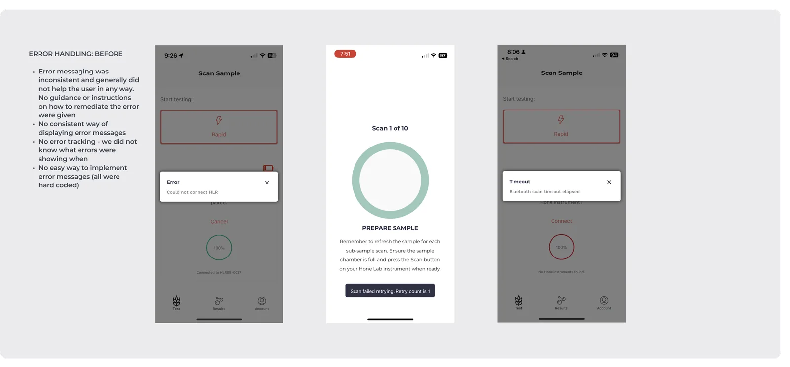
Early adopters often saw error messages they didn’t know how to fix. The messages gave no information, and we couldn’t track who was seeing which errors, or when.
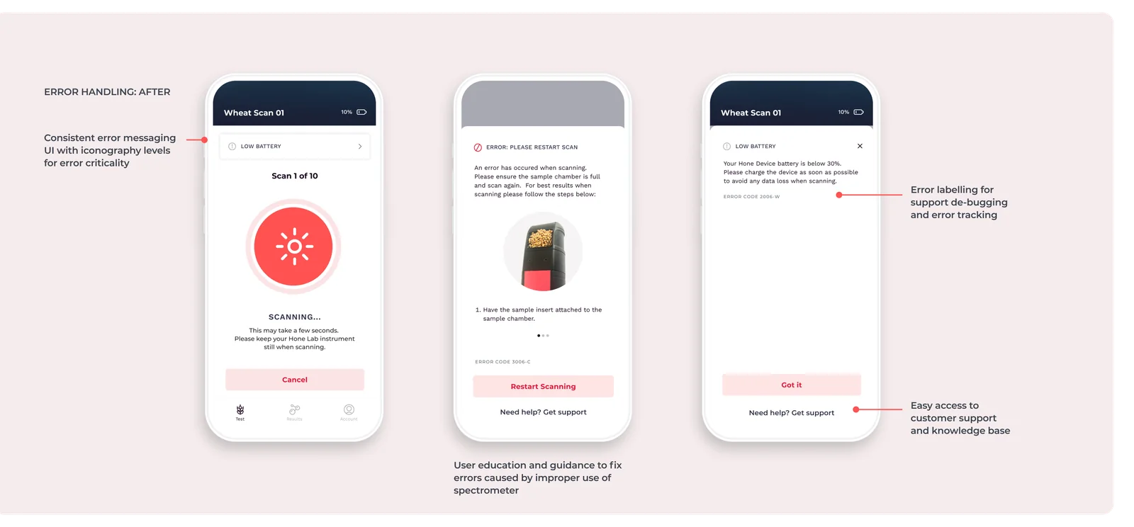
First we reduced the commonly reported bugs and errors that shouldn’t appear at all, using customer support tickets. Then we documented every error message we needed and created a consistent way to show and track them. Messages had been hard-coded, so we used simple design system components to template them, with a clear hierarchy depending on how serious the error was. Engineering built a back-end system to create, update and track messages easily.
Accessibility and consistency
We aligned the whole mobile app to a basic design system for consistency. The update met WCAG AA at a minimum and used larger font sizes throughout, so screens are easy to read outdoors.
Outcome
The Hone Lab Red sold out in its most recent pre-sale release.
There was still plenty to do, with automatic sign up awaiting completion and more support tools planned, like a knowledge base and blog. The plan was to keep gathering feedback from new customers and keep improving the product.